Starting design with space
On Writing Software
I think the place to start designing interfaces is the negative space—the pauses between visual notes. So if you feel inadequate designing a good looking interface, focus on space first.
Padding.
Margins.
Line heights.
Letter spacing.
Many designs feel off because something is off with space. Elements bunched too tightly together. A collection of items that lack equal breathing room. An element that feels like it hasn't snapped into its natural place yet. Something that looks like it's floating away from the design.
Get good at spacing the pieces of your design and you've solved most of what makes an interface feel good.
Let's look at this small piece of layout from Stripe's marketing site, a company whose design I admire.

Stripe's homepage
I like looking at the way text and elements are laid out on marketing sites because no amount of design polish can overcome poor spacing.
Notice the top navigation. There is equal room between each menu item from Products to Pricing. (And though you cannot see this, the hover states of each item start and end half way between each nav item and the next, with an equal amount of hover area for the first and last items, so there's no break in the interaction as you sweep your mouse cursor across the screen).
The Sign In button on the far right is positioned so that the words continue along the same imaginary horizontal line starting from the bottom edge of the Stripe logo, continuing through the bottom edge of the words of the menu all the way to the end. You could've easily aligned the bottom edge of the button to the bottom edge of these words, but that would've bumped the words "Sign In" up. It would feel off.
There's a generous but not egregious amount of space between the navigation and the massive headline Financial infrastructure for the internet. The headline is granted enough personal space to feel comfortable but not too much as if avoiding the menu item's garlic breath.
Now look at the headline itself. There's a tension to it created by the slightly negative letter-spacing given to it, but also a comfortability afforded by a generous enough line-height that matches the distance from the bottom edge of the headline to the top of the subtitle paragraph. The eye leads to the paragraph below it naturally.
And this continues with the paragraph itself. A line-height that gives enough space to the lines of the paragraph but still keeping the whole thing compact enough to fight for your attention. Then, enough breathing room for the Start now and Contact sales options below it. The same eye trick applied to the positioning of the Start now button as we saw in the menu.
There's no mathematically perfect answer for spacing (at least I'd like to think there isn't, that would really suck the fun out of design). You could probably make subtle tweaks to a layout's spacing and come up with equally good results.
The idea is to get good at critiquing space.
Sense where an element feels slightly off and then assess why. Find where you want the tension and where you want the ease.
This knack simply comes with more practice, by seeing lots of informational design not just looking at it. And you can develop this feel for space outside of the screen.
The next time you find yourself at the airport waiting for your delayed flight, get up out of your chair and have a look around. Look at the gate signs. The placards. Any signage with a bunch of text and symbols on it. Get close enough to them so the words feel about as big as they would on a laptop screen.
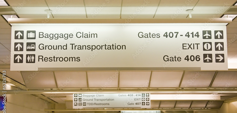
Courtesy Adobe stock images
Notice the space between the text and the edges of the signage. Between symbols and the words around them.
Between sections.
Between headline and paragraph.
Between paragraphs.
Between lines within a paragraph.
Between letters within words.
Now absorb the whole thing.
Notice the invisible lines formed by seemingly disparate elements. Do the edges of them magically line up (vertically or horizontally)? Do they guide your eye down or across the whole thing effortlessly?
Which signs feel better and more comfortable to the eye? Which signs feel off and why? Is it because the space between each line is a smidge too much? Is it because the letters are spaced a bit too wide? A tad too tightly? Smidges, bits, and tads. Those spatial differences separate good design from bad.
Take mental notes. Do the same with restaurant menus (fancy ones and hole-in-the-walls), bus schedules, TV sports score bugs, book covers, book pages, billboards, and brochures. Anything with words and imagery on them. Develop a sense of what feels good and alter the values of the CSS properties padding, margin, line-height, and letter-spacing on your HTML elements to convey that sense in your designs.
I prefer to feel space and not get too mathematical with it. Start with a guess, look at the result, and tweak from there. I'd rather not know if there's an optimal readability ratio between a font's size and its line height.
I'd rather know it when I see it.