One small tweak can make it all make sense
Last week, I released Yellopages, a Chrome extension that replaces the default “start” page you see when opening a new Chrome window or creating a new tab.
Yellopages gives you better ways to find the tabs you have open—like filtering tabs with notifications or tabs playing audio. It also gives you a single search for your open tabs, bookmarks, and browsing history. It groups tabs from the same domain together, making it simple to, say, kill all your Gmail tabs.
Yellopages didn’t begin as a start page replacement: It started as a popup on your Chrome browser bar. The features in the beginning were nearly identical to the end product but how you got to it wasn’t.
See I had envisioned this extension being a thing you would “call up” (via clicking an icon on your browser bar or using a keyboard shortcut). And somewhat like a jukebox, you could thumb your way around your open tabs and get to the page you were looking for.
So I called it Tab Jukebox and gave it an old-time jukebox feel. Here’s an early, unfinished take:
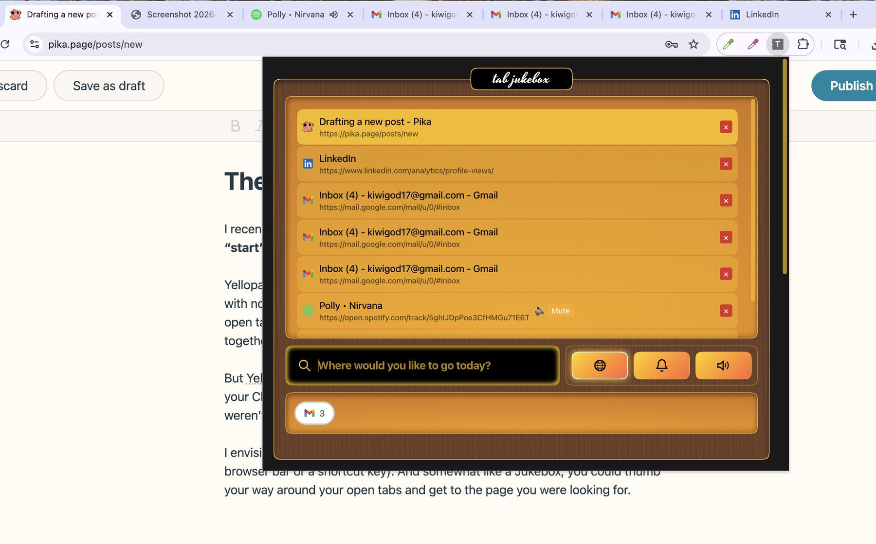
Early version of Yellopages as a browser bar popup instead of a “start” page replacement.
I liked the idea a lot. I got a kick out of the aesthetics. It felt unique and memorable. But I never really enjoyed using it.
I think this is one of the hardest parts of creating: You can love something as a maker but not as the user. Kill your darlings, they say.
Still, I pressed on because I couldn’t figure out why I didn’t enjoy this app as a user. I thought maybe the feel of it was getting in the way, so I dialed back on the design to something more like the monochromatic snoozy design we see today.
But that wasn’t it.
Then one day, in one magical cliché-of-a-moment, I realized what it was. The “popup” didn’t feel right—it felt incongruous to how I’d actually want to use this thing.
- When I can’t find a tab I may have open, I instinctually open a new tab.
- When I have 15 Gmail tabs open, I instinctually open a 16th one.
- When I want to search for something I was looking at before, I instinctually open a new tab and start typing.
- Anytime I don’t know what to do in Chrome but I want to get somewhere, I instinctually open a new tab.
The whole problem with the product was how to get to it.
Jukebox to Yellow Pages
Once I discovered the problem, I converted the extension to a start page replacement and it instantly felt right. And though I still love the metaphor, the jukebox idea felt arbitrary.
The app, now in wider view, felt more like a directory, a wayfinder. The idea of the old yellow pages directory popped into my head. It also let me clean the design up a bit. I think it still has personality but one that doesn’t scream in your face.
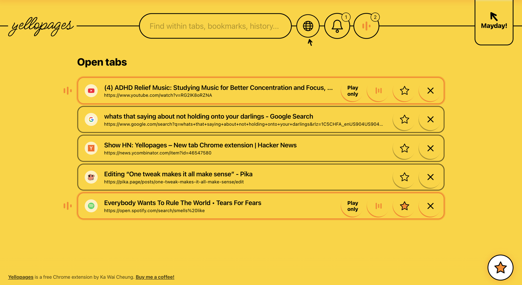
The current yellopages startpage replacement design.
Circling around a name
I didn’t want to call this “Yellow Pages” for obvious reasons, and also because anyone under 30 would have no recollection of those books. Instead, I tried to play on the name…
First, Hellopages. This was about saying “hello” to your web pages again, the ones you may have lost 30 tabs in. I liked it but perhaps the name was too far away from the metaphor.
Then, Yellow Tab. I liked using the word “tab” because that’s the real struggle with browsers — tabs shrink to the point where they’re indecipherable. But then it sounded like a play on the yellow cab. And that makes no real sense.
Finally, Yellopages. This seemed like it cut right through both problems. Sounds like “Yellow pages” and saying “Yello!” to your web pages again.
I don’t know if the name’s any good…but it’s what I’m going with. I do think the product has legs. Hope you’ll give it a try: yellopages.kawaicheung.io.