I think mobile designs cause forgetfulness
I’ve become more forgetful over the past few years. Haven’t you?
That tired experience of walking into a room not knowing why you decided to go there happens almost as frequently for me as that of walking into a room, getting distracted by something in that room, going down a rabbit-hole in that room, only to realize an hour later I had a completely different reason for being there.
Forgetting that I even forgot.
I’m hearing a lot more folks are experiencing forgetfulness these days. People of all ages. And one theory I saw floating around recently has me thinking: It’s that doomscrolling on your phones preconditions your brain to this cache-clearing pattern:
- See something
- Throw that something out of your memory
- See something else
When you do this constantly, your brain’s trained to do this for everything else—its way of coping with the environment.
But I’ll propose a more precise hypothesis: It’s not just the way we consume that makes us forget, but the one-way nature of the consumption: The up-and-down, single axis approach inherent to mobile designs.
Maybe, forgetfulness is an artifact of mobile layouts.
I recently stumbled upon a copy of the We Are Mammoth blog circa 2010 on an old portfolio site of a former employee (what’s up Anthony!). It’s non-responsive and the front-page looked roughly like this.
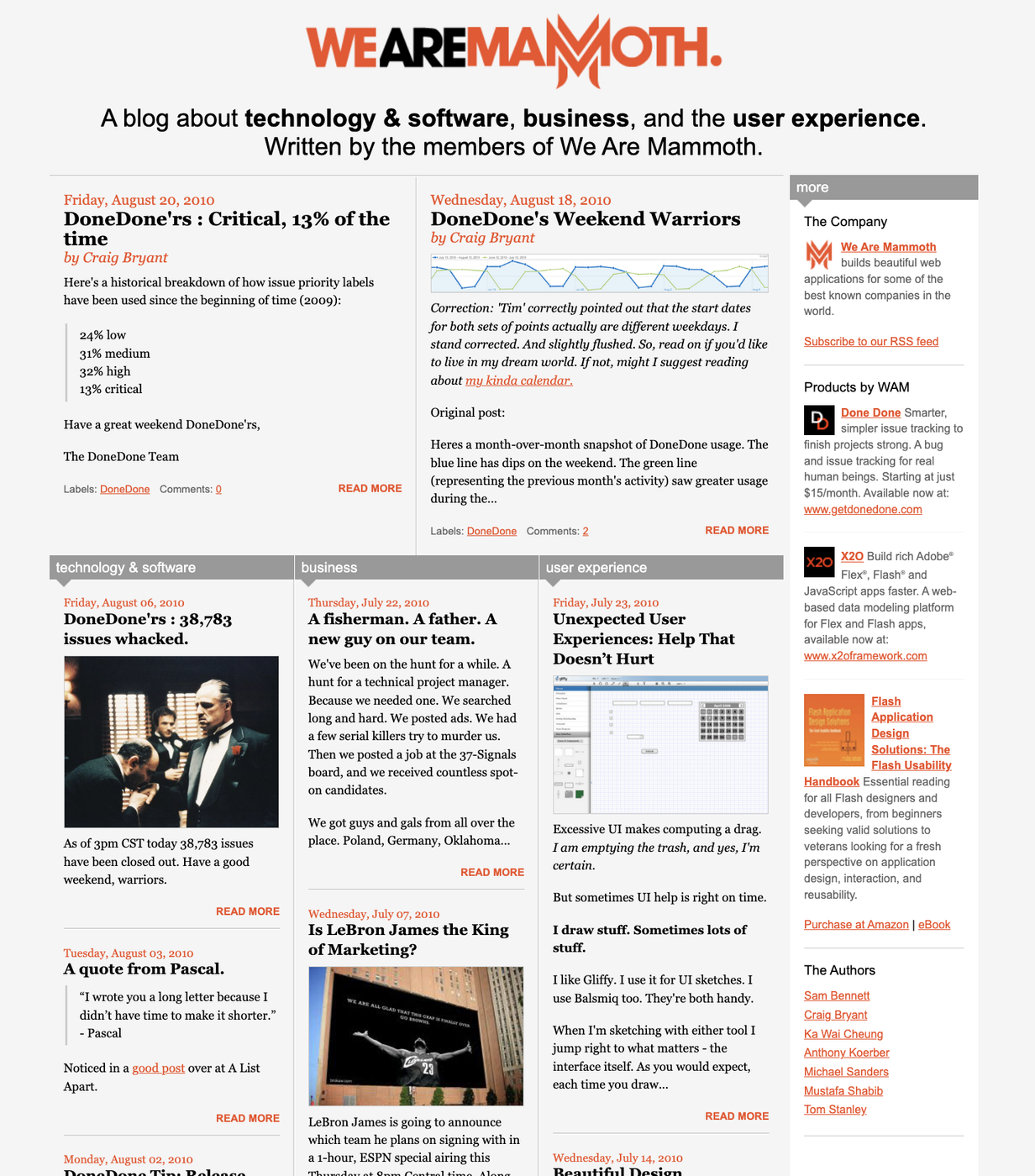
When I look at this on my laptop, my eyes want to meander. My eyes frolic. Galavanting in an open field, not a hamster-wheel. Absorbing the content like a defroster erasing the fog off my windshield. Things come into view gently, from multiple areas, at different moments.
They start somewhere top-middle and work their way around the page. Roughly in a circular pattern, sometimes going one way, sometimes another. I then scroll down a little bit, stop, and observe again. I look vertically and laterally and at angles. I go back to something I saw for more detail.
Multi-dimensional layouts help me remember inherently because of their design. The big thing was here in the middle. The tangential things off to the right. This thing was near that thing, but further away from the other thing.
Large screen designs exercise my brain in a way that a mobile-friendly design just can’t. The myopic viewpoint of phone screens rob your eyes of the chance to absorb peripherally, because there is no periphery.
What was there is gone. What’s next is hidden. The visual equivalent of walking into the room distracted by whatever the thing is that’s staring you in the face now and forgetting what you were just thinking about.
Visual nuances help me remember. The act of my eyes moving over a stationary plane, rather than a plane scrolling over my stationary eyes, helps me remember.
The content of social media may be polluting our brains—but that kind of stuff has always been around. Whole TV careers have been made out of that kind of fodder.
Video shorts that I tell my kids watch when I tell them not to? That might be another reason. But in the end, my kids (and I) actually remember a lot of that content.
I’m beginning to think the real hidden culprit to modern-day forgetfulness is the one dimensional, treadmill-like sameness of scrolling mobile designs.
If I can get off this phone one day, maybe I’ll find out if I’m right.